Nike Hotspots Redesign
UX Design
Time
March 2023
My role
Product Designer, User Researcher
Tool
Figma, Usertesting.com
Stats
Live on Nike’s Product Detail Page.
Background
When Nike became a client of Stylitics, the Nike Hotspots widget was initially conceptualized by Nike and developed by Stylitics. While other Stylitics clients adopted the general offering version of Hotspots, we recognize the need to provide Nike with an updated and enhanced version of Hotspots. This tailored solution will enable Nike to maintain a distinctive edge in the market while the general offering version of Hotspots continues to be used by our other valued Stylitics clients.
This also presents an opportunity to unblock our Sales team, allowing them to continue promoting the general offering to other clients, and to leverage innovation with Nike, thereby strengthening our partnership.
As we embark on this endeavor, our primary focus is to determine what enhancements will genuinely excite Nike and deliver exceptional value to the brand. By focusing on their specific needs and aspirations, we aim to create a solution that drives their success while solidifying our ongoing collaboration.
01. Research
To discover the most exciting redesign solution for Hotspots that resonates with Nike's customers, my research approach involves delving into the shopper's browsing experience and examining how different brands cater to their online shopping needs. Initially, I conducted an in-depth exploration of various shopping Hotspots available in the market. Given that Stylitics primarily serves non-luxury brands, I divided my study into two parts: the shopping experience on fast fashion websites and the shopping experience on premium fashion websites. This comprehensive approach allows me to gather valuable insights and inspiration from both ends of the fashion spectrum.
Design approach
How are Hotposts Designed in the market?
Amazon
Speedo
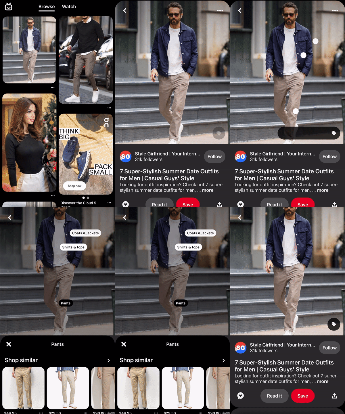
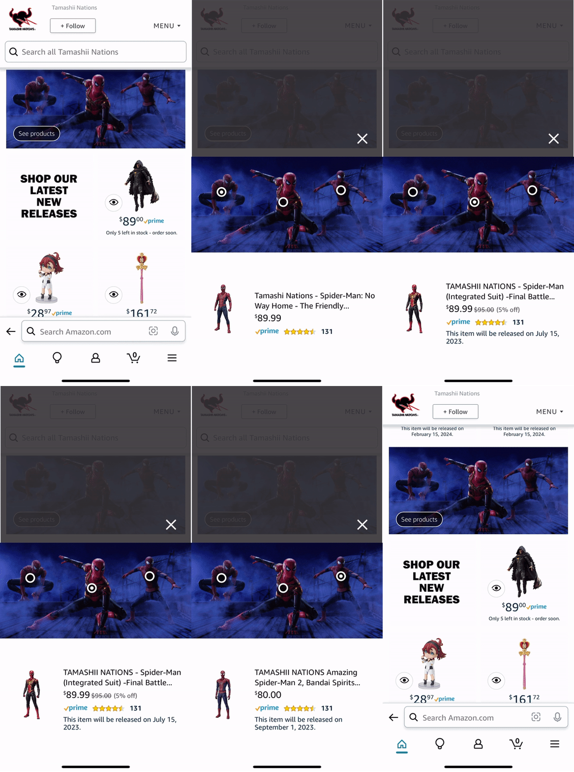
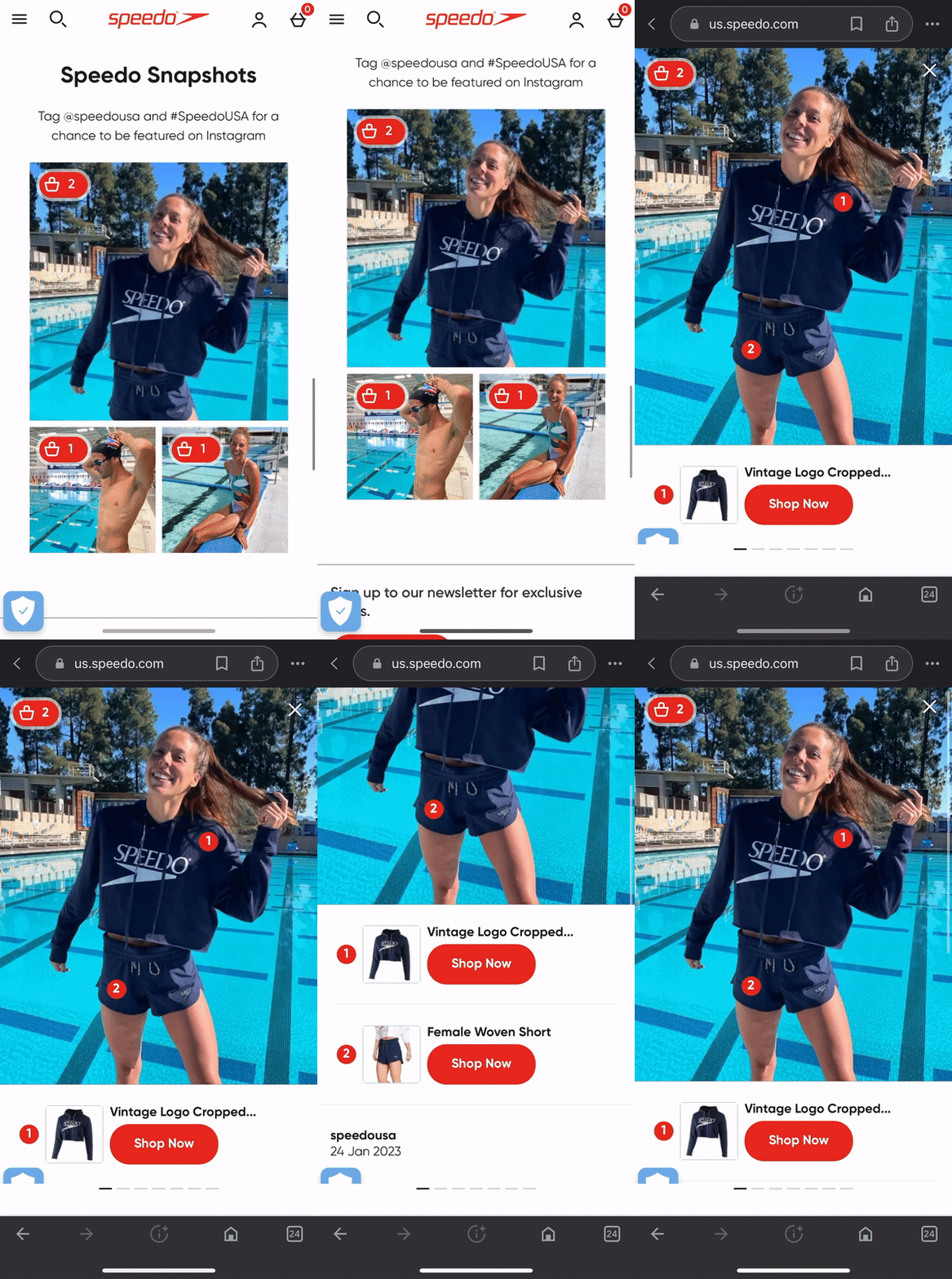
In my investigation of popular social media and e-commerce platforms, I examined how Hotspots are designed for shopping content. From my observations, it appears that many designers have primarily focused on the UI aspect of Hotspots, rather than considering the overall user experience.
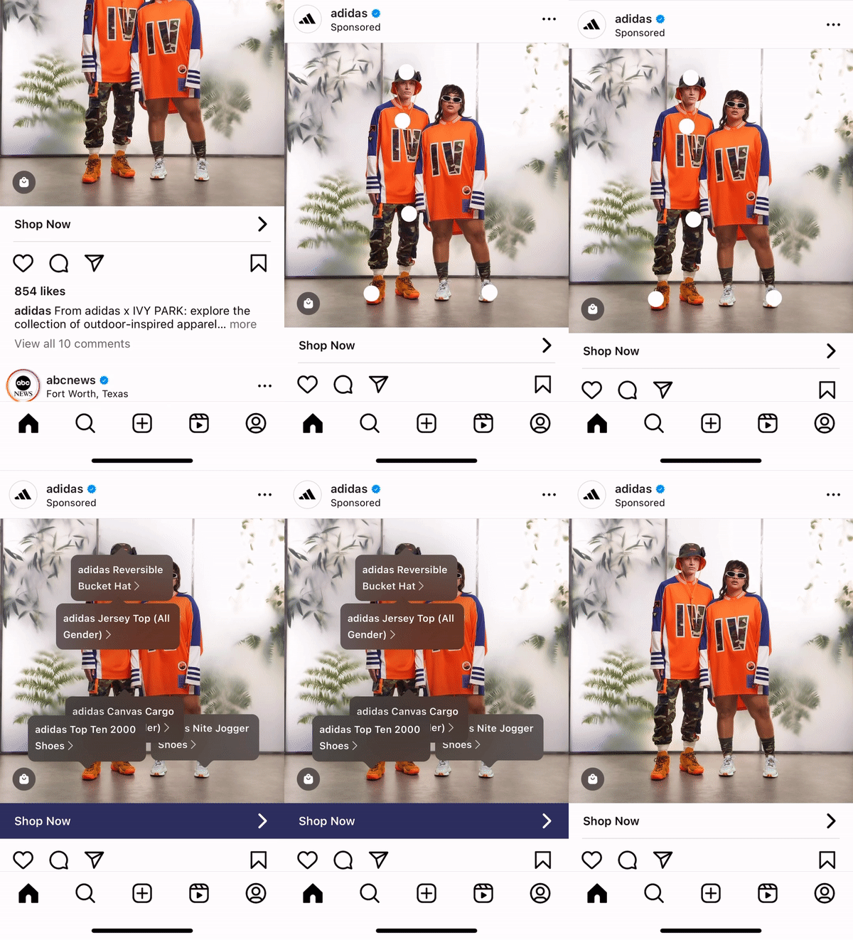
For instance, on Instagram, the introduction of white dots upon tapping the screen creates a smooth transition, but the product information ends up overlapping. Pinterest, on the other hand, faces a UX challenge as it fails to consistently display the tags when users navigate back to the image or select other items. Amazon and Speedo take a different approach by presenting the product information separately as a list, detached from the main image.
Comparison between Fast Fashion and Premium Fashion Brands
Fast Fashion brand 1
Fast Fashion brand 2
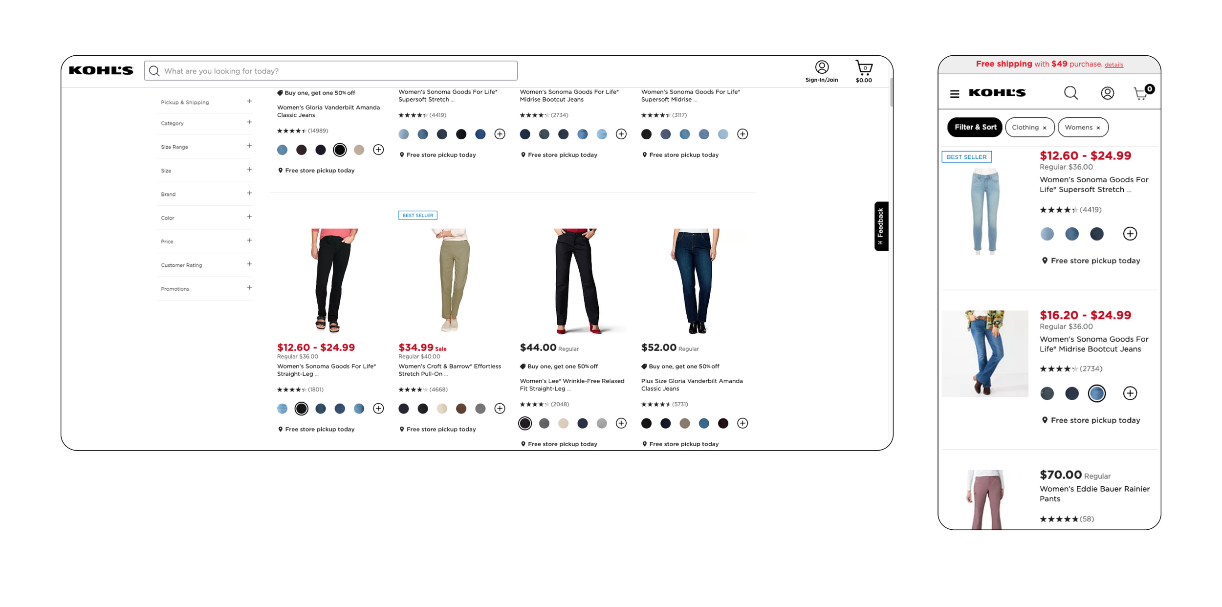
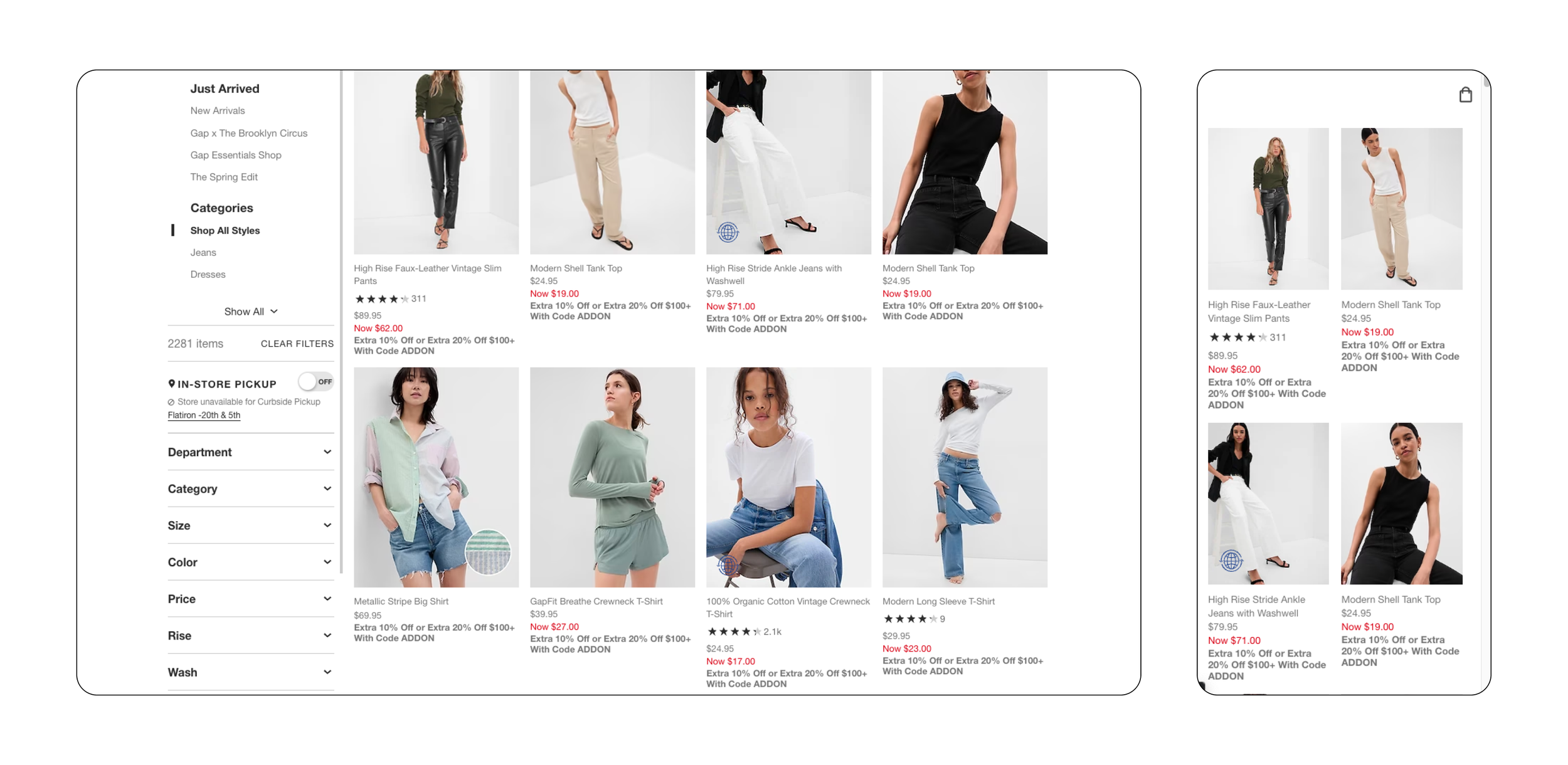
Let's take a look at two examples of fast fashion websites. On their category pages, you'll find a vibrant display of 8 products with bold font and bright colors. Each product is accompanied by ample information, providing details such as the product name, price, available sizes, and color options. The brands consistently highlight promotional information beneath each item, emphasizing their commitment to affordability and value for customers.
The entire website reflects the dynamic nature of fast fashion brands. It visually showcases their dedication to providing an extensive range of information to shoppers. The commitment to showing information is evident across the website.
Premium Fashion brand 1
Premium Fashion brand 2
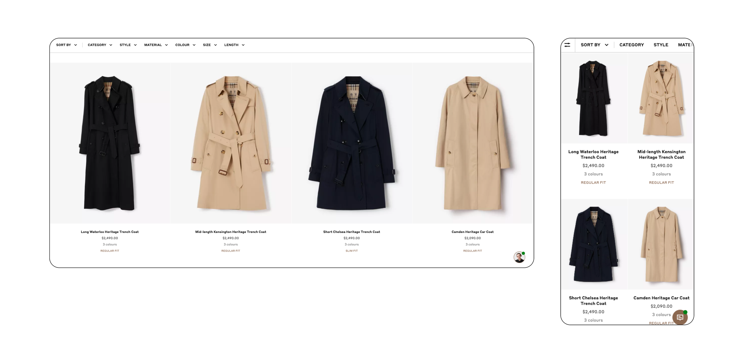
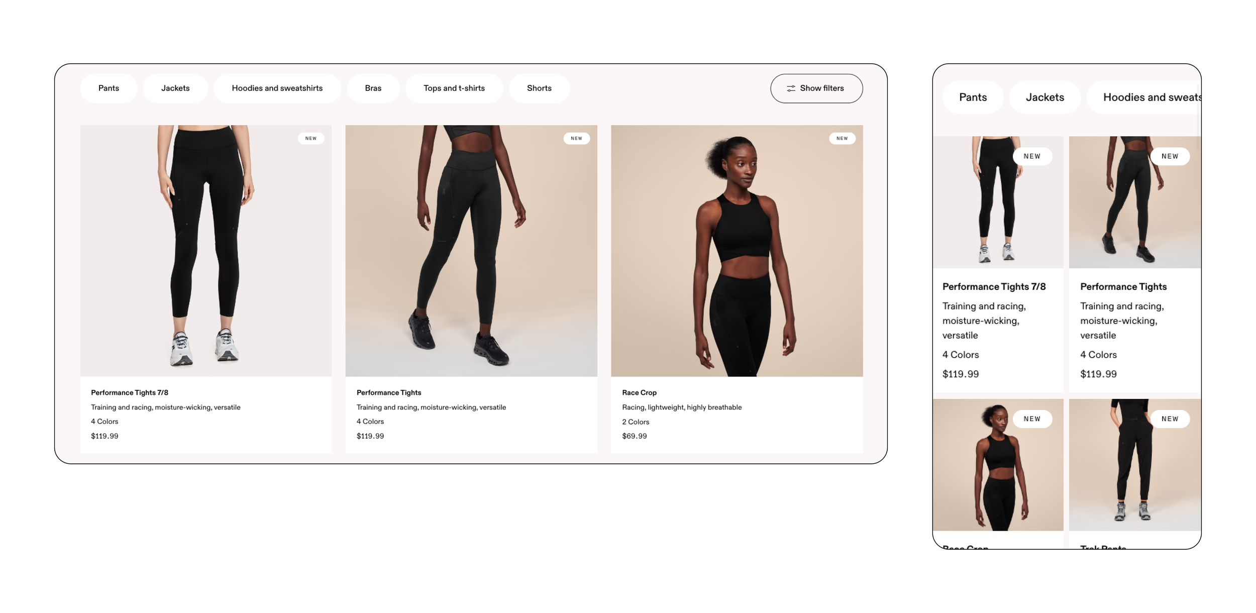
The two screenshots above showcase examples of premium fashion websites. These websites demonstrate a meticulous approach to information presentation, employing minimalist design principles and utilizing neutral colors in their design language. They feature a clear and concise design, guiding shoppers to focus on the product image initially and gradually introducing additional information like the product name, price, and available colors. The visual hierarchy of the information architecture is thoughtfully executed, with a deliberate absence of bold fonts and bright colors for promotions.
02. Define
What Could be Improved?
After conducting an exploration of other shopping hotspots available in the market, as well as analyzing product pages from various brands, I have identified three potential opportunities to enhance Hotspots feature:
Interaction Design: One important consideration is how we present Hotspots to shoppers. Should it activate with a click/tap, hover-over action, or auto-pop-up? Each approach has its advantages and affects user experience and engagement. Choosing the right presentation method is crucial for maximizing Hotspots' impact and usability.
Presentation Method: Another aspect to consider is whether Hotspots should have a linear or non-linear flow. A linear flow guides shoppers through a predefined sequence of information, while a non-linear flow allows for more flexibility and personalized exploration. The optimal flow depends on Hotspots' specific goals and desired user interaction.
Content: Retailers have different needs and preferences for Hotspots content. It's important to identify valuable and relevant information for shoppers. This can include product details like materials, sizing, and care instructions, as well as styling tips, and customer reviews. Understanding retailers' content requirements enables us to tailor Hotspots, providing an enhanced shopping experience.
By addressing these opportunities, we can refine Hotspots to provide a more intuitive and engaging shopping experience, catering to the preferences and goals of both retailers and shoppers alike.
Looking at the Original Design
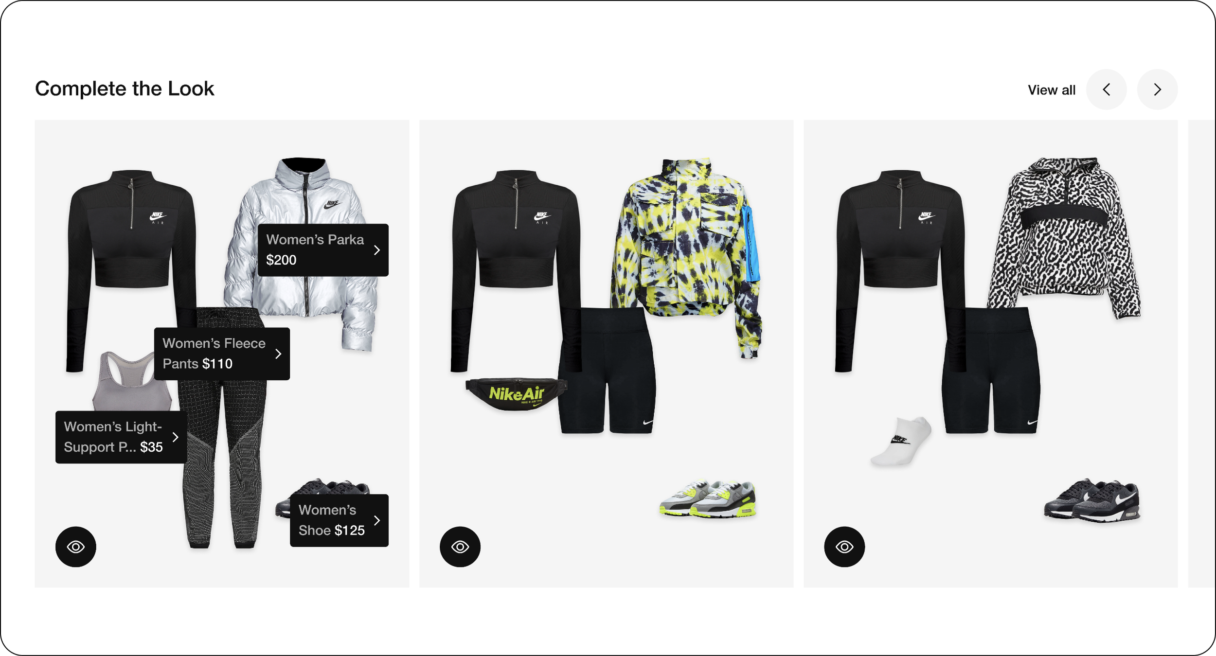
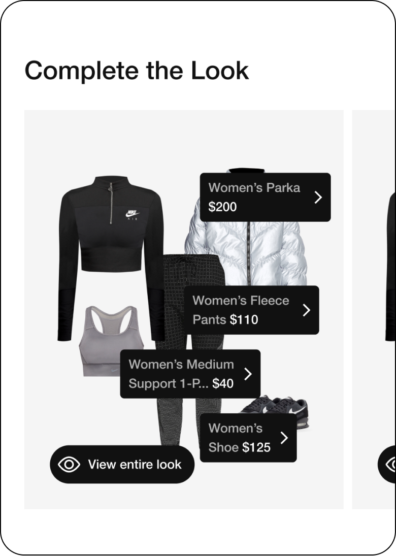
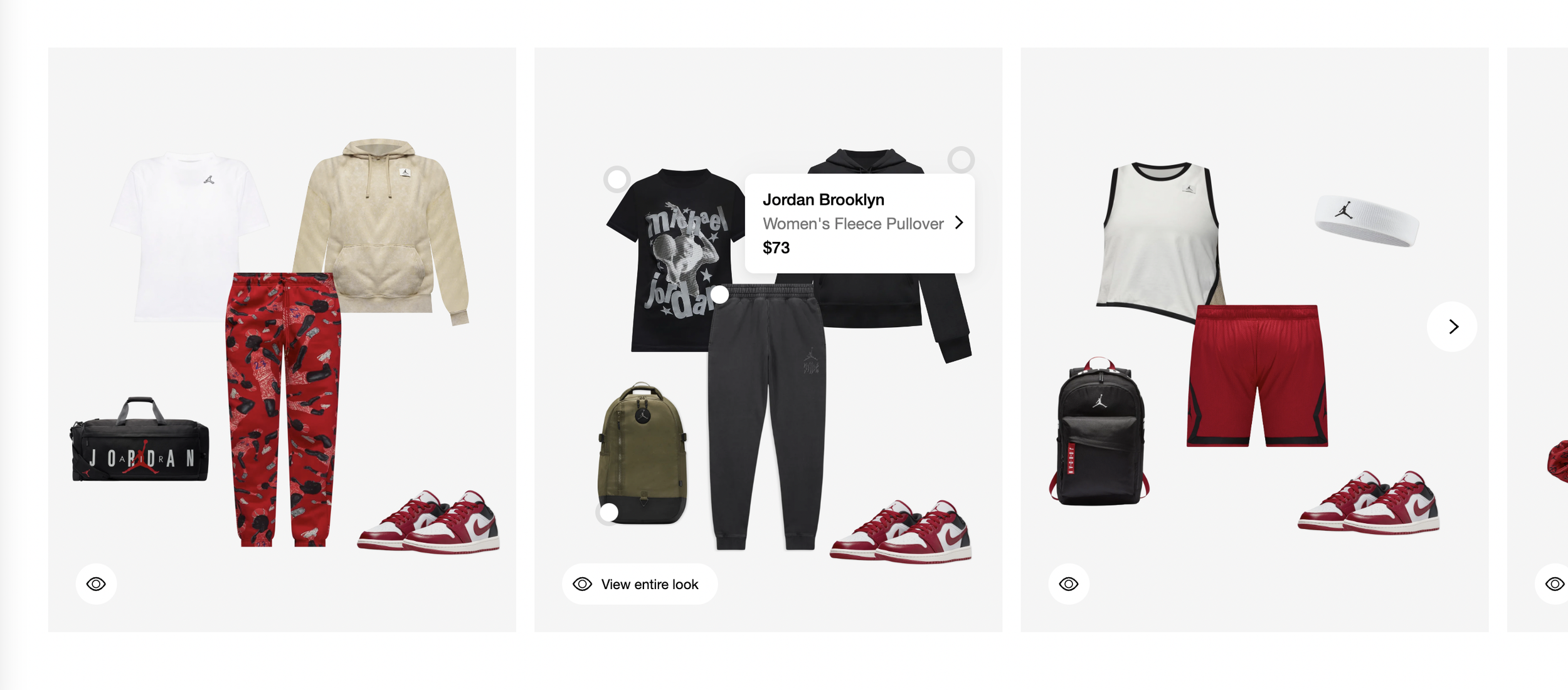
The original Hotspots design, created by the Nike team, featured a widget where shoppers could hover over it or tap it to reveal information labels. However, this design had certain drawbacks. Firstly, when all the labels were displayed, the UI design obscured parts of the product images, negatively impacting the visual experience. Additionally, the design offered a passive approach, presenting all the information at once, which had limitations on content visibility. Consequently, this design had the potential to hinder the overall shopping experience for users.
03. Design
New Components
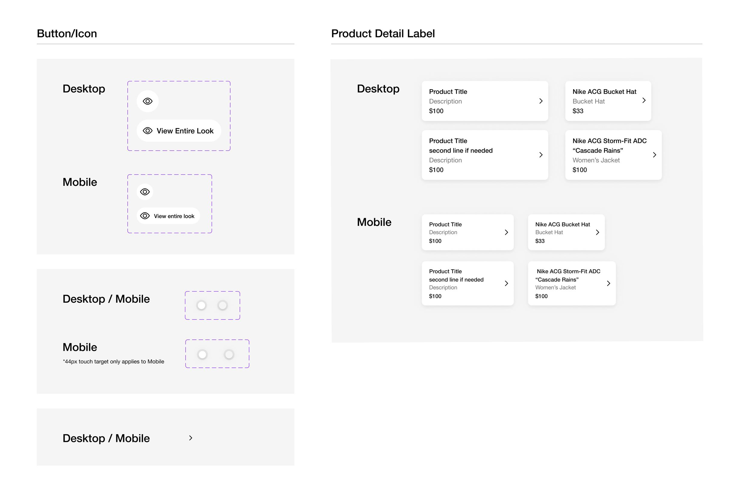
New UI and UX
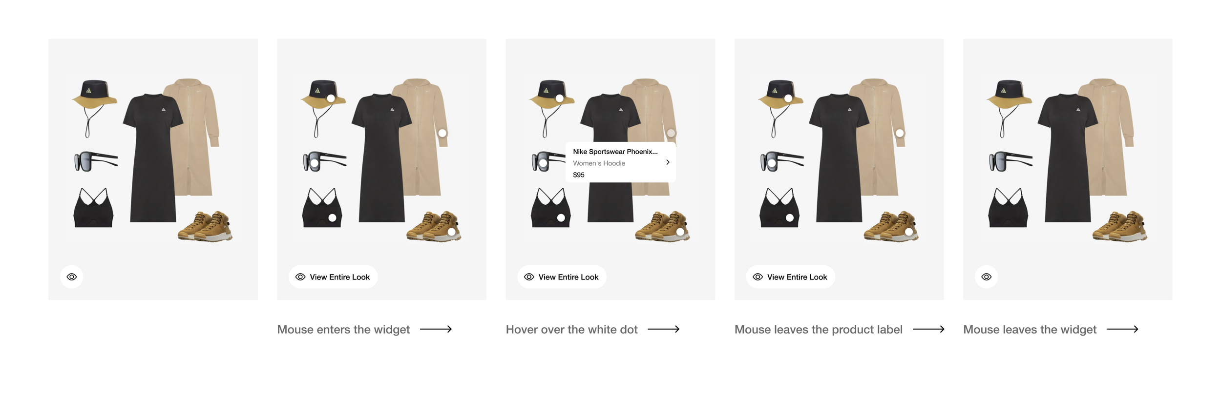
On Desktop
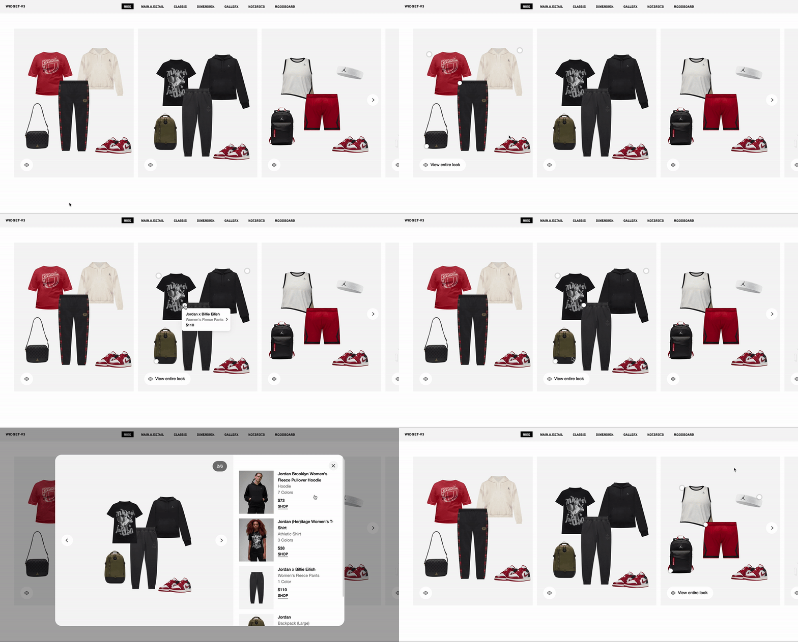
To maintain a clean and uncluttered UI, I have decided not to display all the product information simultaneously upon hovering over the widget.
I added an additional step for hover-over because this interactive approach will give the users control and empower them to selectively view the information they desire, resulting in a more user-friendly and visually appealing presentation.
By incorporating an extra hover-over step, I want to ensure a clear design with easily readable product information. This enhancement allows for a well-organized display of essential details, including the product name, category title, and price, on the label.
On Mobile
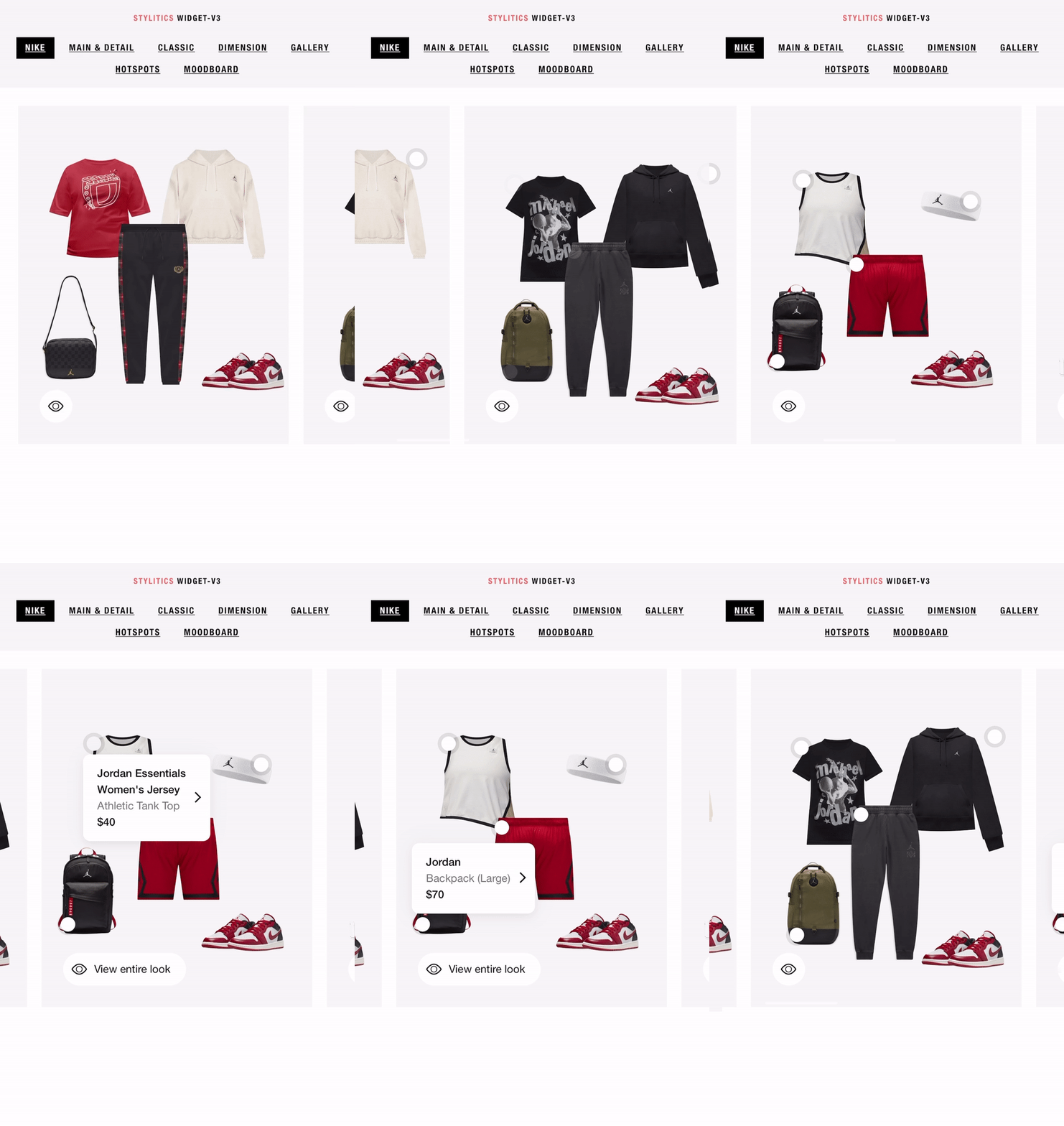
Since there is no hover-over on mobile, the white dots are revealed using an auto-pop feature. This enhancement aims to optimize users' browsing time. When the widget is 70% in the viewport, the white dots will appear. If users scroll away from the widget and return to it within the same session, the white dots will automatically reappear without the need to refresh the page. These changes contribute to a more seamless and efficient browsing experience on mobile devices.
04. Usability Test
Purpose of the test
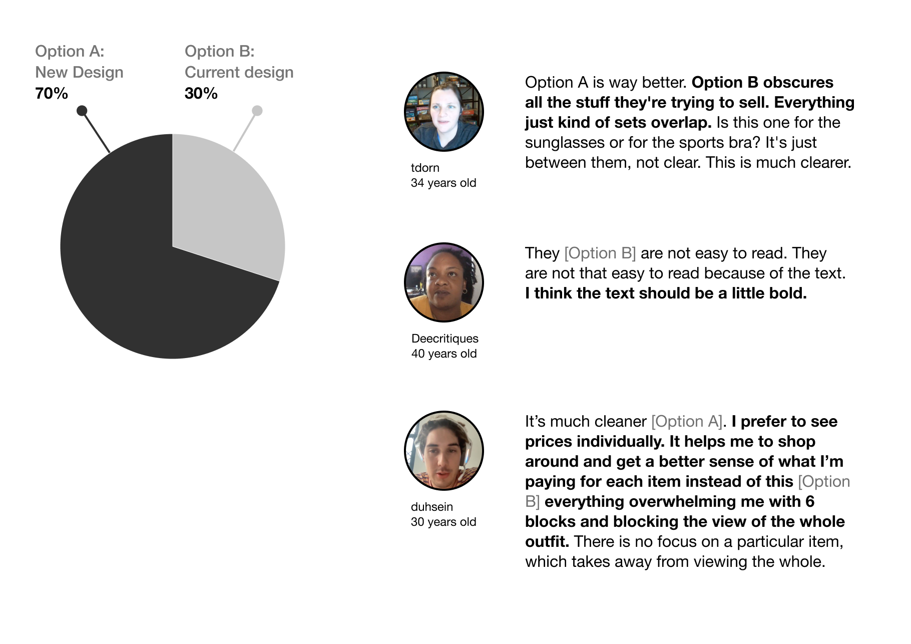
Based on my explorations, I have identified three potential design opportunities to enhance the Hotspots experience. It is crucial to determine whether the new two-step interaction design actually improves the user experience for our users.
To evaluate the effectiveness of the new design, we will conduct an A/B test using three key perspectives:
Ease of use: Assess which design option is more intuitive and user-friendly in terms of interaction.
Readability: Analyze how easily users can read and comprehend the displayed information in both design variations.
Visual appeal: Consider the aesthetics of the designs and assess which one is more visually pleasing to users.
User preference: Gathering user feedback and preferences to learn which experience users prefer.
By conducting this comprehensive A/B test, we aim to gather valuable insights that will guide us in making informed decisions about the most effective design for Hotspots.
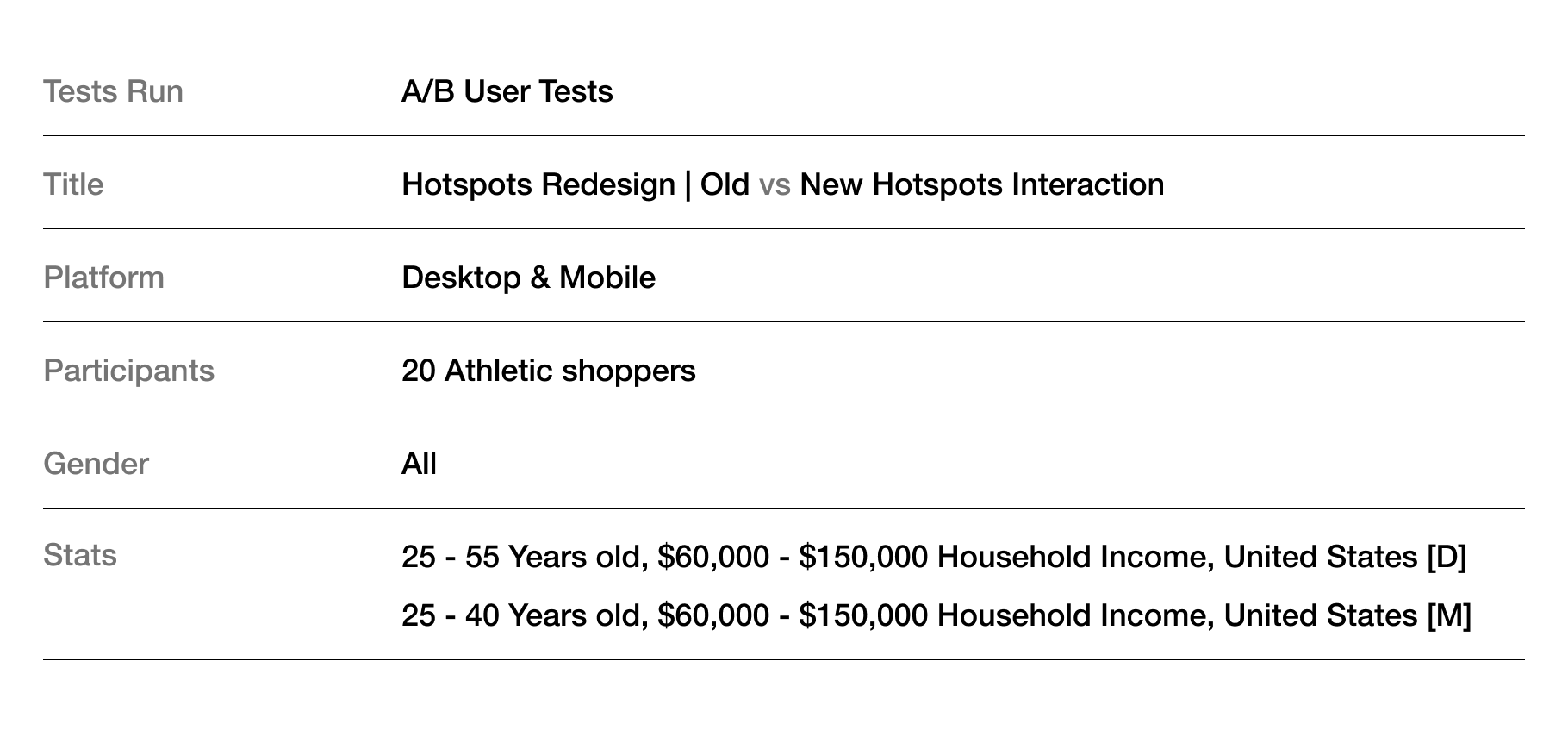
User Test Details
User Test Results
05. The Live Demo
Collaboration with Nike
Following the team-to-team meeting with Nike, we received positive feedback regarding the new design, and Nike expressed their enthusiasm to proceed with its implementation. Our engineering team successfully completed the development work in May, and currently, the Nike team will be conducting an A/B test in September or October to assess the key performance indicators (KPIs) associated with the new design. This testing phase will provide valuable insights into the effectiveness and impact of the design on Nike's metrics.